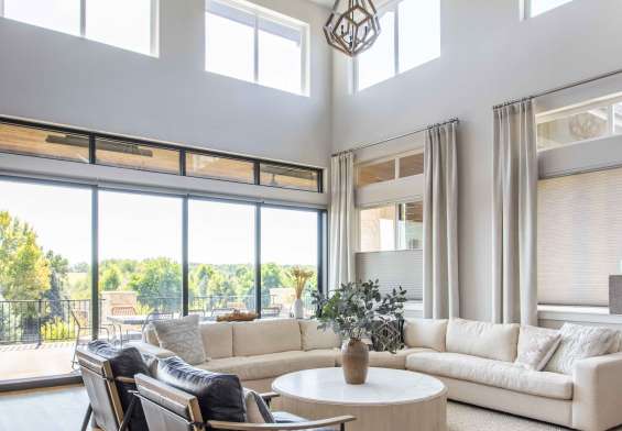
One of the best parts of the job when you’re a Realtor is getting to see tons of seriously gorgeous homes. And in Central Park, a master-planned community where the oldest houses were built a mere 25 years ago, it’s especially fascinating to see how owners make each builder model their own. I see so many inspiring rooms and smart upgrades.
So we’re doing a series of posts you’ll see here on Central Park Scoop! The idea is to answer the questions we get all the time from neighbors and clients: How do I make my builder floor plan feel more “me”? What’s worked well for others with the same model? We’ll celebrate local design talent, give homeowners attainable inspiration, and showcase the creativity happening right here in our neighborhood. Here’s the second installment of the series, featuring an absolutely stunning powder room.
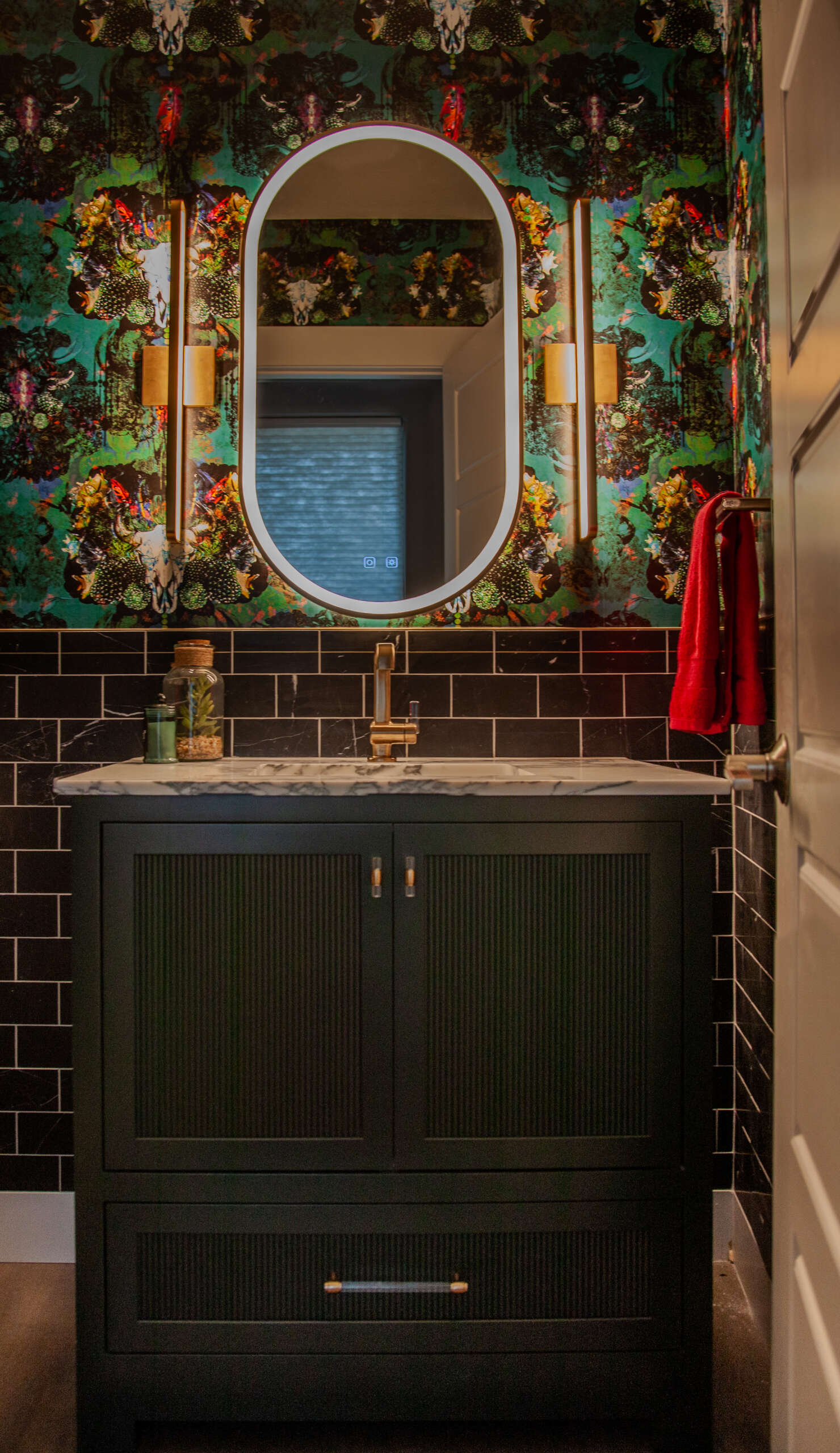
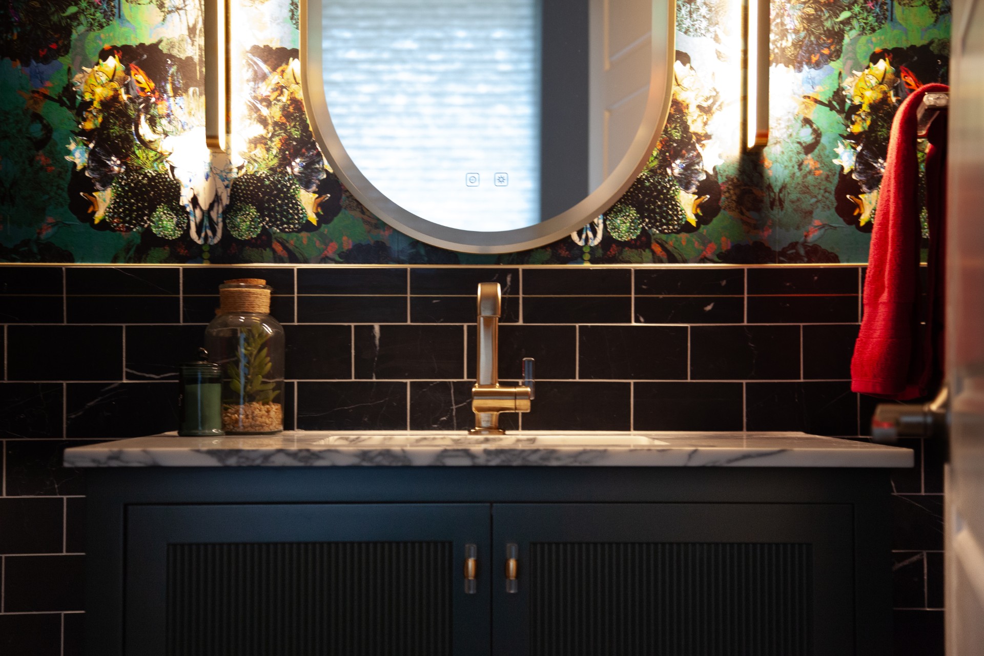
Our first Focus on Design post was about an underappreciated space getting the attention it deserves. Along with laundry rooms like that one, powder rooms are getting their time to shine! When I saw the photos of this powder room designed by Kaimee Martelli of Plum Kitchens Cabinetry & Design Studio in a Wonderland Cimarron home here in Central Park, I thought it was such a great example of the kind of bold approach you can take in these simple spaces! Kaimee shared some of the details behind the project.
What did the client ask for and how did you deliver on those goals?
The main goal was to make it fun! And the wallpaper was the first piece we fell in love with so everything had to work around that.
Any special considerations when you’re working with this type of bold color and darker palette?
In a powder room, you can go bold and dark and not need a lot of light. We actually have all the lights on dimmers to keep it a bit moody.
It seems like a small space like a powder room gives you freedom to go really bold–do you agree? I totally agree! It’s a small space, so why not take chances. And it’s one of the main spaces guests see when they come over, so why not make it a conversation piece.
What do you feel were the biggest successes of the project?
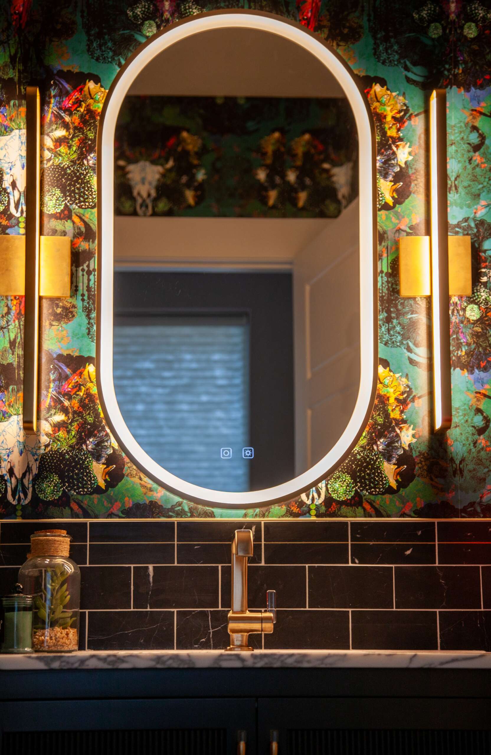
The layered lighting is a big success. We used fun sconces but also added a lit oval mirror. It gives more opportunities to create ambience. Also, the marble top is a hit. Marble is so fabulous and a powder room is a space where people feel safe using it—the material is softer and stains more easily, so it’s not a favorite for kitchens.
For other people who love the look—what would you tell them to keep in mind to achieve something similar?
If you are going with a statement piece like this wallpaper, keep other items more toned down. For example, we used a deep green vanity that doesn’t compete for attention, but still offers fun texture with the reeded door. Also look for ways to tie in elements across all of your selections. We used this gorgeous Brizo faucet with an acrylic handle and found cabinet hardware with a similar acrylic detail. This helps everything feel cohesive. Check out Plum Kitchen’s Facebook and Instagram for even more design inspiration, and whether you’re an owner or designer, share your photos of houses in Central Park with me for consideration for upcoming posts!